DATA VIZ/ILLUSTRATIONS
Hi MSF friends,
I’m putting together a sample of my illustrations and data viz for you to get a taste of some projects I think will work for your needs. I am really passionate and dedicated to MSF work, and excited for the possibility to collab together again. Thanks for taking a look!
DATA VISUALIZATIONS
Here’s a mix of data visuals that I’ve created for MSF in the past.

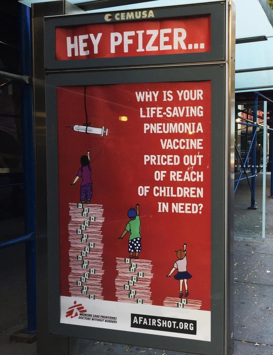
MSF ACCESS CAMPAIGN SOCIALs
Here are some social media dataviz/illustrations I created for the Access Campaign that bring data to life.


LONG FORM EXPLAINER VIDEO
Here is an example of an explainer video that capture my approach to talking about data, explaining an issue, and animating it to life. I know you’re looking more for graphics/illustrations, but you can get a look at the data viz within the video.
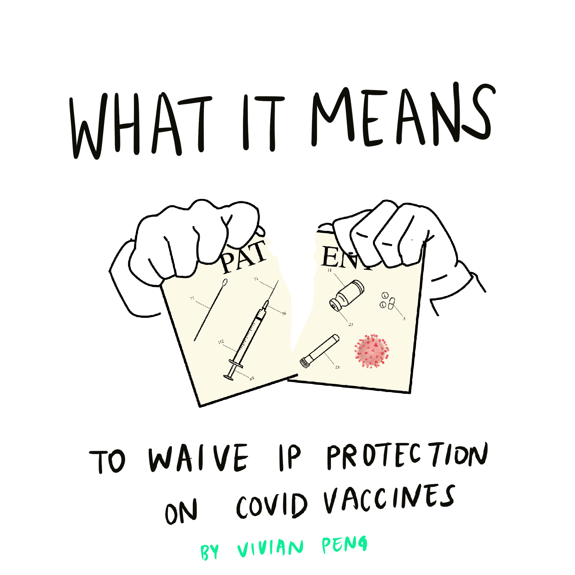
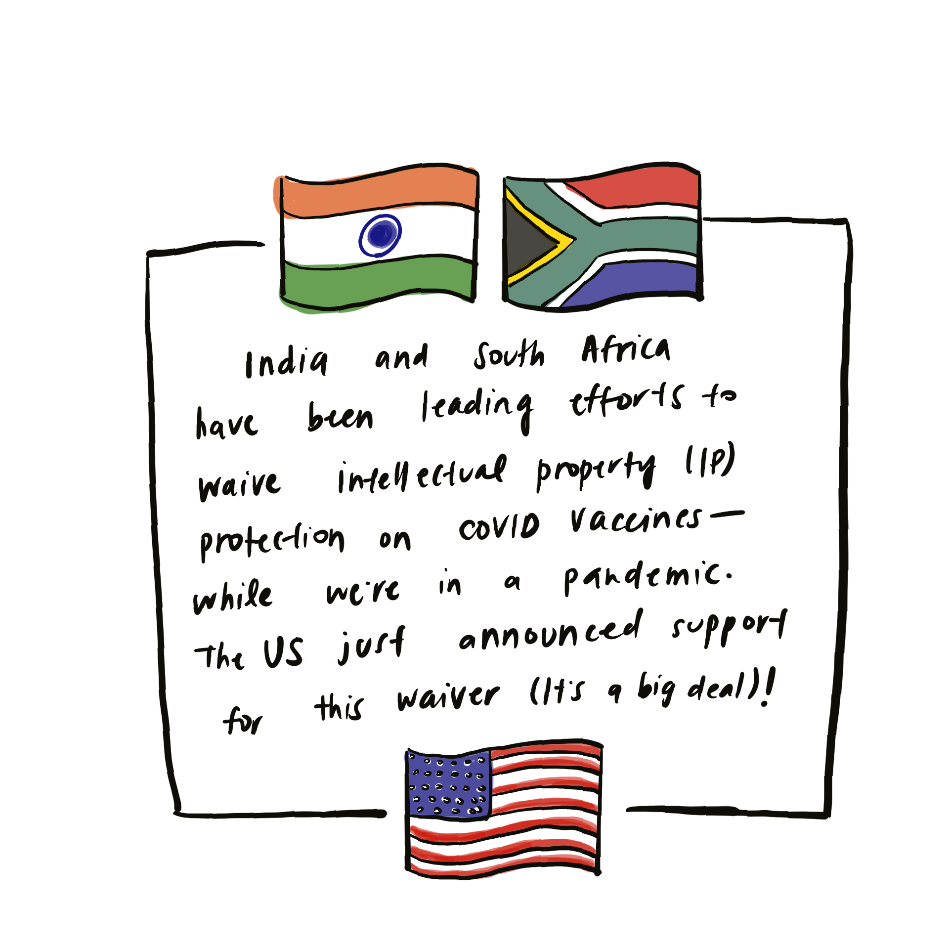
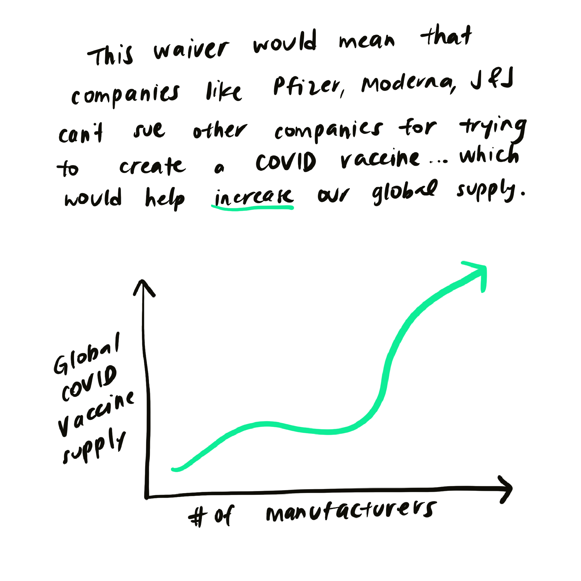
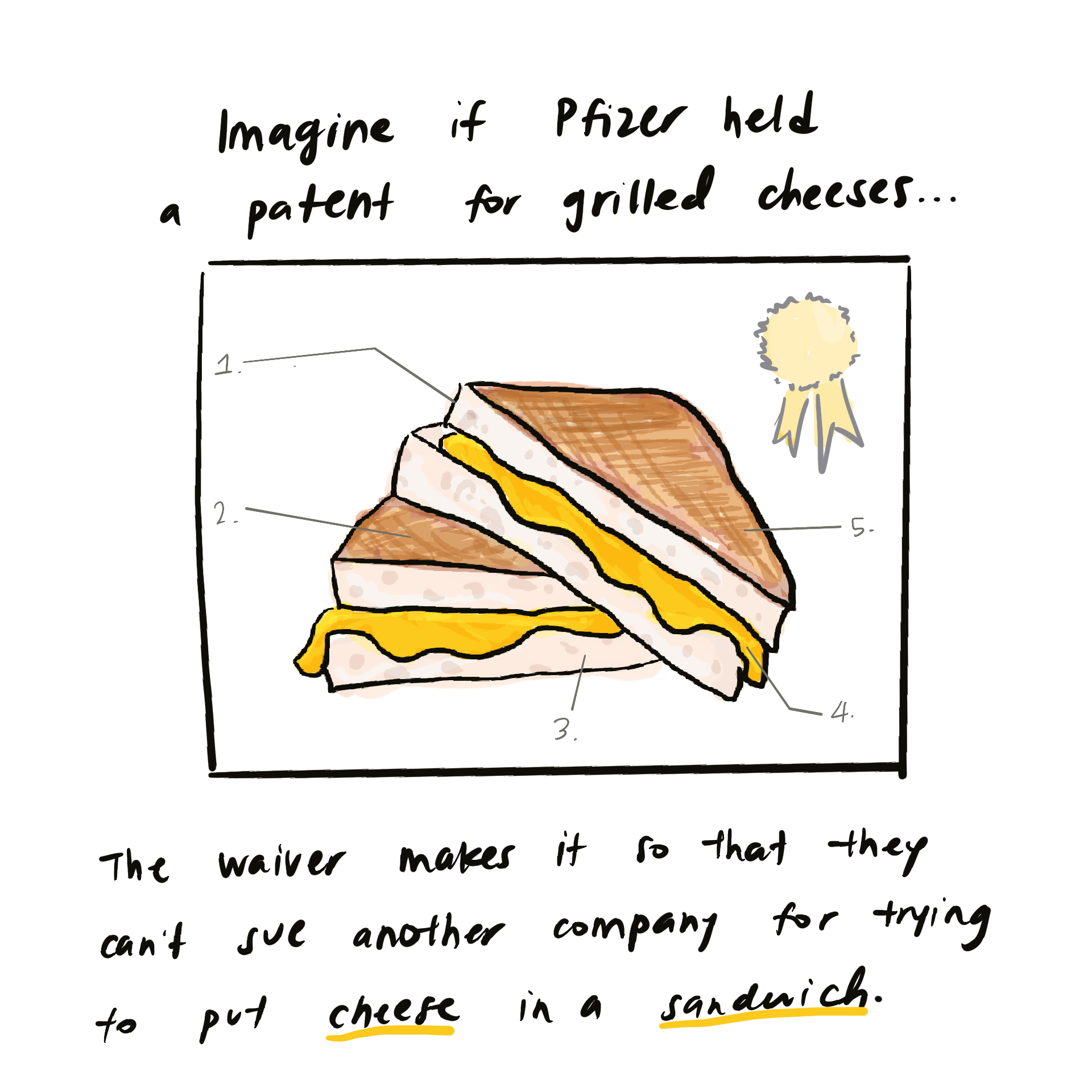
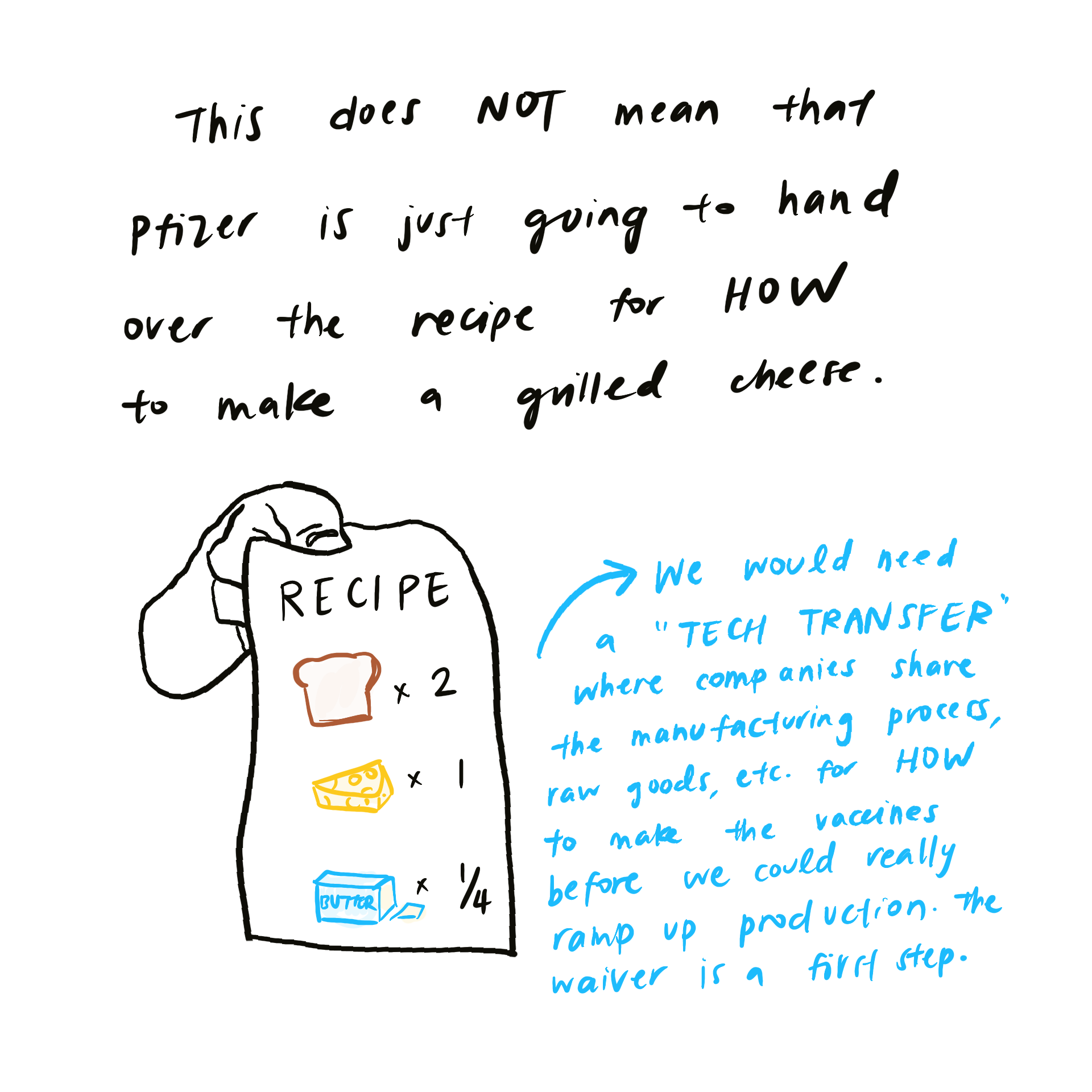
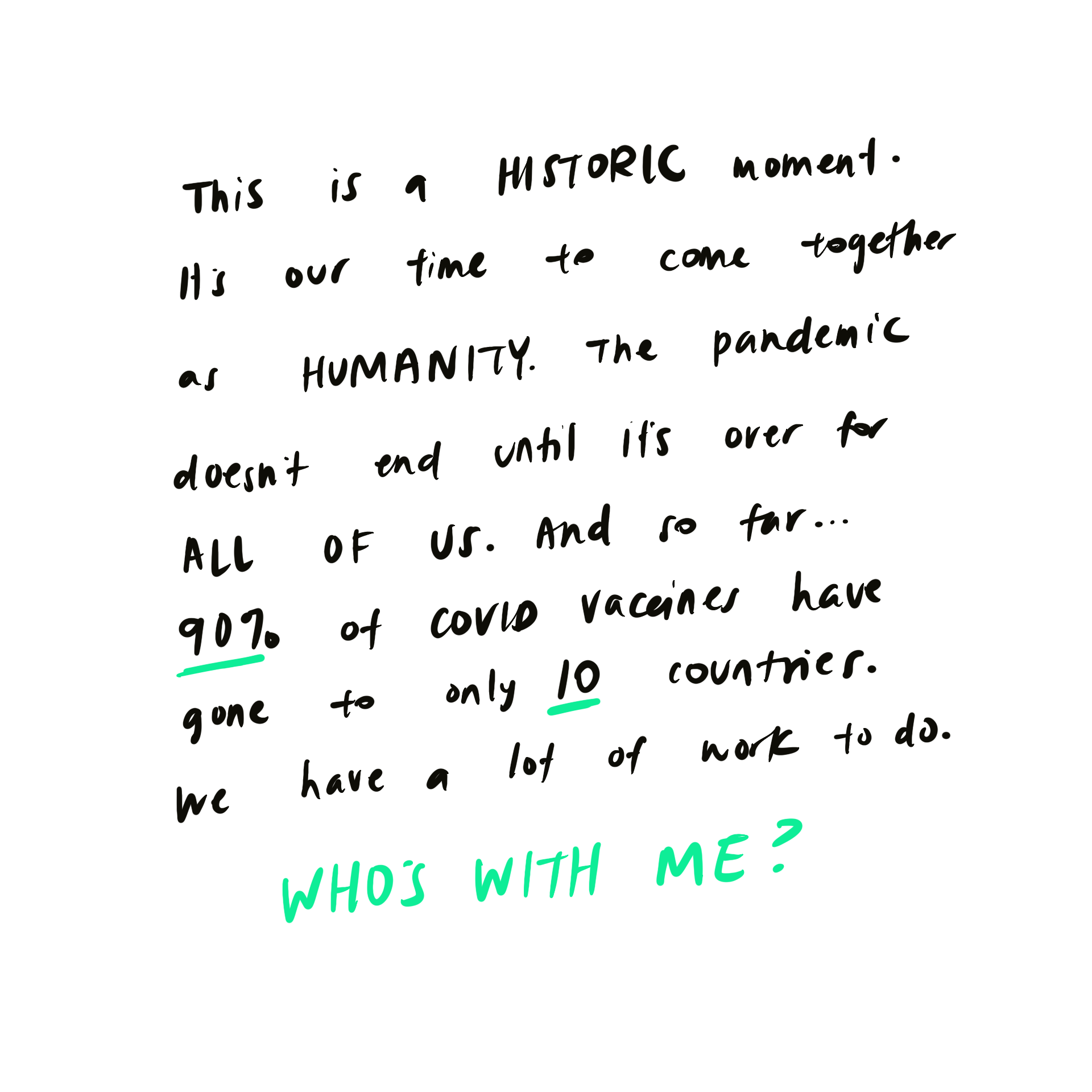
COVID19 VACCINE ILLUSTRATED STORY
Here’s an illustrated story I created to explain the fight against IP protections during the pandemic. I’m sharing these to give a sense of how I like to break down complex IP-related issues with analogies that everyone can understand.